Harry’s Ice Cream Co
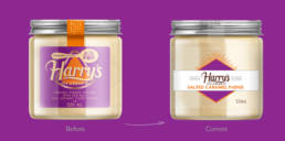
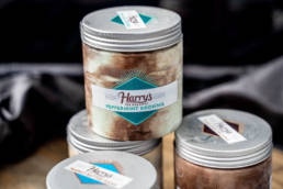
Harry’s indulgent quality is very hard to beat and we knew it would take a special something to create a visually appealing design to reflect Harry & Larry’s belief in how ice cream should taste and present itself.
Less is more was our approach so it was all about decluttering the label to allow the product to speak for itself.
We maintained clear, simple messages instantly communicating the right cues and paying tribute to the founders of the company and their dedication to meeting their customers’ needs.
ClientHarry & Larry’sServicesBranding refresh, Packaging, Promotions, Advertising.
Share


